Issue 005 5 minutes
Sound Gefährlich
Contrast → Pattern Break → Commitment. Three moves. No hedge.

For the builders refusing to be background noise. High-signal. High-taste. Culture. Craft. Leverage.
Read time: 5 minutes. Creative ROI: Compounding.
✨ VIBE CHECK
Morning. Sharpen something.
Scrolled the feed lately? Everything on it is trying to be liked. Polished vocal. Polished caption. Polished hook. Polished edit. Nothing is trying to be dangerous. Nobody wants to grab you by the throat. Everybody wants to be petted.
Cute.
There’s a German word I keep coming back to. Gefährlich. It means dangerous. In production it means: write a song that grabs ‘em by the throat and builds a universe so compelling it’s very hard to leave.
Nobody’s making Gefährlich right now. Everybody’s making nice. Nice is the new mid.
Today’s level: put contrast on the plate. Stop auditioning to be liked.
🧨 AGAINST THE GRAIN
Nice gets skipped. Contrast gets stared at.
The chef’s rule: memorable dishes don’t strike a single tone. They feature opposites that surprise the palate. Soft and crunchy. Sweet and spicy. Dark and bright. Hot and cold. That’s the rule of every record you’ve played more than three times, every album cover you’ve stared at, every ad that actually stopped your thumb. The work that keeps you is the work that put two opposites on the same plate and refused to resolve them.
Most “good taste” right now is single-tone. Same palette. Same cadence. Same vocal register. Same color grade. Everybody’s “cinematic.” Nobody’s dangerous. Everybody is on-brand. Nobody is on purpose.
That’s not a category. That’s a group chat.
💰 Tactic to pocket: Look at the thing you’re about to ship. What’s the opposite of its dominant tone? Put a pinch of that in. Not half. A pinch. That’s the sweet + spicy. That’s the plate that gets served twice.
THE TOP 5
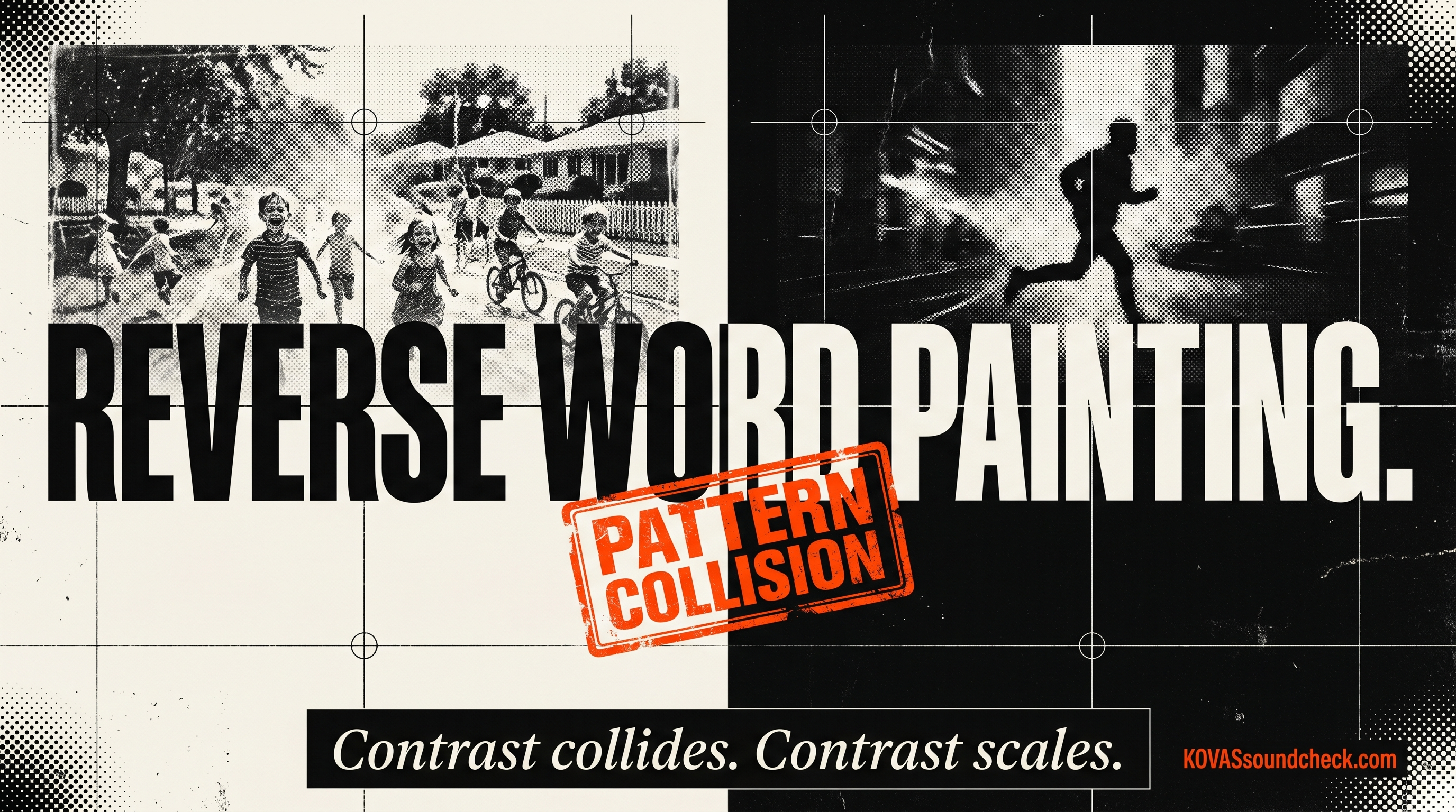
🎧 ONE THING I’M PLAYING: REVERSE WORD PAINTING (“PUMPED UP KICKS”)
The hit: Foster the People, “Pumped Up Kicks.” Bright, warm, summer production. Handclap rhythm section. Whistled hook you’d put on a beach ad. Lyrics about a kid with a loaded gun.
You sang along before you knew what it was about. Then you felt weird. That’s the trick working.
The term: Reverse Word Painting. Music plays opposite a dark lyric to create impact. The flip of regular Word Painting, which colors the emotion of a lyric with its musical counterpart. Regular word painting matches. Reverse word painting collides. The collision is what turned that song into a sync placement machine and put it on the radio for a year.
Contrast scales.
Why it matters: If your score, your product copy, your brand voice, your album, if any of it matches itself, it passes by. If it contradicts itself on purpose, it stops the scroll. You don’t need to invent a new genre. You need to collide two tones nobody thought to collide.
Business translation: The boldest move in a careful market is not “bolder.” It’s opposite. A whisper on a shouty feed. A hand-drawn logo in a category of clean sans. A documentary-slow cue in a high-octane pilot. Contrast is the cheapest differentiator you can buy. Your creative director’s PhD isn’t required. Your ears are.
💰 Tactic to pocket: Open your current project. Write down the dominant emotional tone. Now write its opposite. Drop a 5-10% dose of that opposite into the work. One line, one beat, one frame. Listen for the reaction.
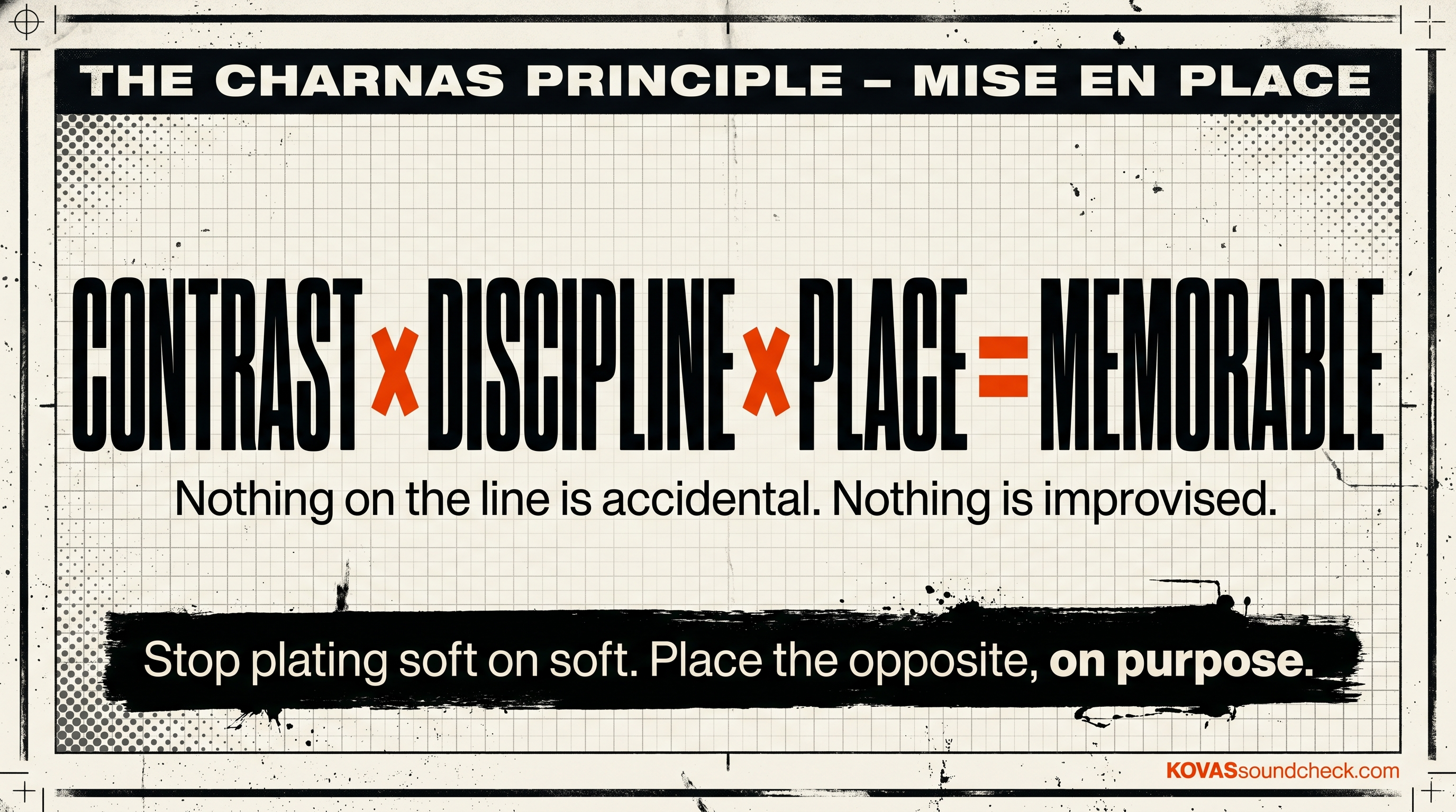
📖 ONE THING I’M READING: EVERYTHING IN ITS PLACE (DAN CHARNAS)
The source: Everything In Its Place: The Power of Mise-En-Place to Organize Your Life, Work, and Mind by Dan Charnas. Same Charnas who wrote Dilla Time, which tells you everything about the angle he comes from. Studies kitchens like he studies J Dilla. Same lens.
The idea: Mise en place. Everything in its place. The French culinary system that every great kitchen runs on: every ingredient, every tool, every station, prepped and positioned with intention before service starts. Nothing on the line is accidental. Nothing is improvised. Nothing is “we’ll figure it out.”
The contrast on your plate is the same principle. Opposites don’t end up there by accident. They’re placed there. With discipline. By design.
Everything we make is a plate. The people we want attention from (directors, supervisors, founders, fans) aren’t diners. They’re chefs. They’re looking at your plate for what’s deliberate. If the plate is all soft, they walk. If the plate is all sharp, they walk. The plate that gets served twice has both, and it has both on purpose.
Why it matters: For builders, founders, creative directors, the category you’re in is probably single-tone. Everybody’s making the same “premium” shoe, the same “elevated” coffee brand, the same “minimalist” SaaS home page with the same Helvetica Now and the same gradient hero. Groundbreaking stuff. Really pushing the envelope there.
The plate that breaks is the one with a pinch of the wrong thing, on purpose, in its place.
Hard line: If nothing on your plate surprises, nothing on your plate gets remembered.
💰 Tactic to pocket: Pull up your current work. Name its dominant flavor in one word. Brainstorm 10 opposites. Pick one. Put a controlled dose of it into the piece. Place it on purpose. If the team flinches, you’re close.
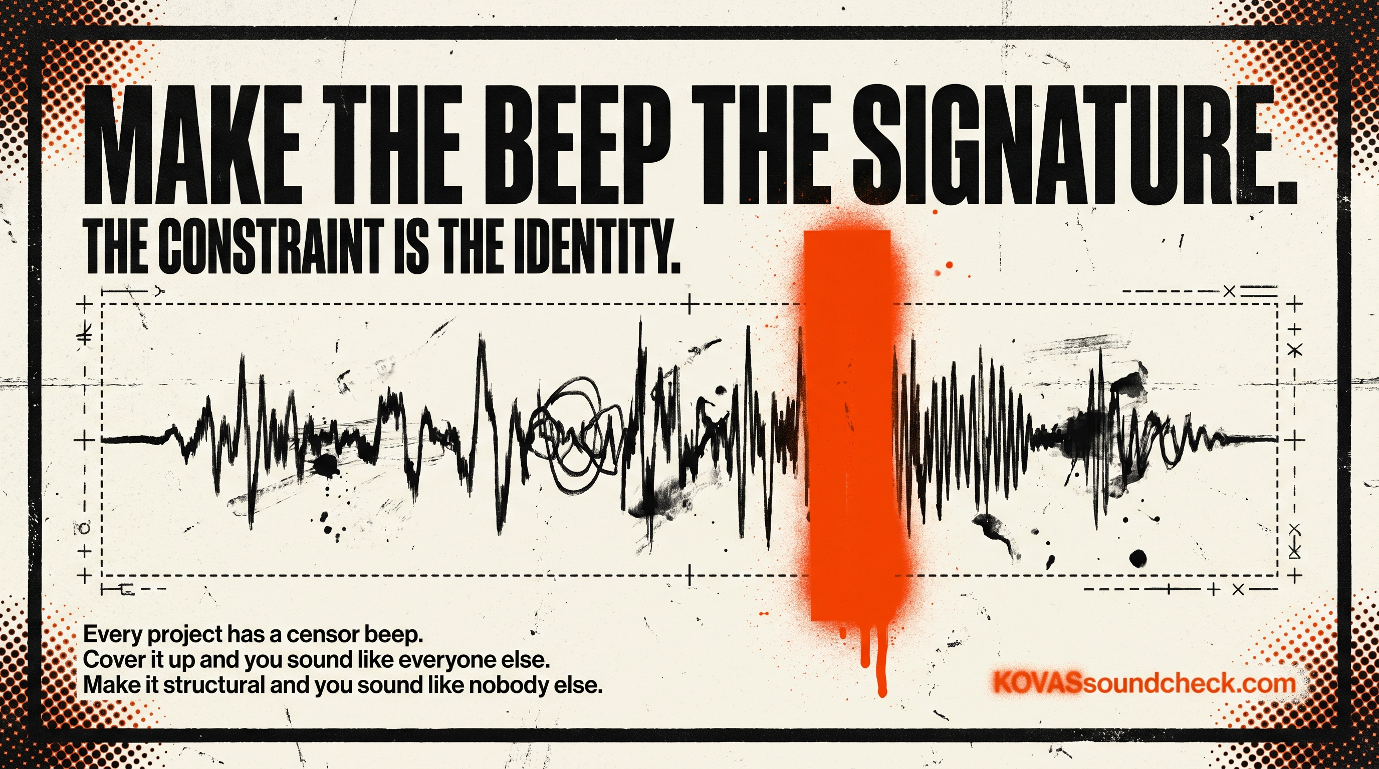
💡 ONE IDEA I CAN’T SHAKE: THE CENSOR BEEP IS THE HARDEST TRANSITION
The idea: The thing in your project that seems broken is probably the thing that can carry the most meaning. If you let it.
The scene: I have a journal entry from September 2022 I’m still mining. (Yeah, I write craft notes to myself at 2am like a freak. You’re welcome.) Straight off the page:
“The censor beep is the hardest thing to put as a transition between sections of a song.”
Four reasons, in the note:
- The beep is a non-musical sound in a musical context. A crash, a sweep, a drum fill, those are inside the language. The beep breaks the language for the duration it lasts.
- It’s culturally loaded. The beep means censorship, which means the song was made for somewhere the song isn’t allowed to be itself. That’s a meta-layer most transitions don’t carry.
- It has no rhythmic negotiability. Most transitions let you place them where the groove wants them. The beep has to land on the word it’s covering. You’re scoring around a structural constraint set by the lyric, not the arrangement.
- It has to feel both deliberate and accidental. Too deliberate and it sounds like a choice. Too accidental and it sounds like a mistake. The sweet spot is tight.
When it works, the beep becomes one of the few transitions that carries meaning about the song itself. About its relationship to the listener, the platform, the culture. That’s rare. Most transitions are invisible. A well-placed beep is visible and structural.
Why it matters: Every project has a censor beep. The thing that seems like a problem. Platform restriction. Weird client note. Budget cut. Constraint from legal. An asset that came in wrong. The average operator covers it up. The Gefährlich operator makes the constraint itself carry the signature. That’s where identity lives.
Business translation: Your competition is dealing with the same platform rules, the same algorithmic limits, the same client restrictions. Everybody’s in the same cage. The ones who use the cage as a brand move are the ones you’re going to remember. Everybody else is hiding the beep and wondering why their work feels invisible.
(It’s not invisible. It’s just covered up.)
💰 Tactic to pocket: What’s the censor beep on your current project? The thing that seems like a problem to cover. Make it the signature instead. See what carries.
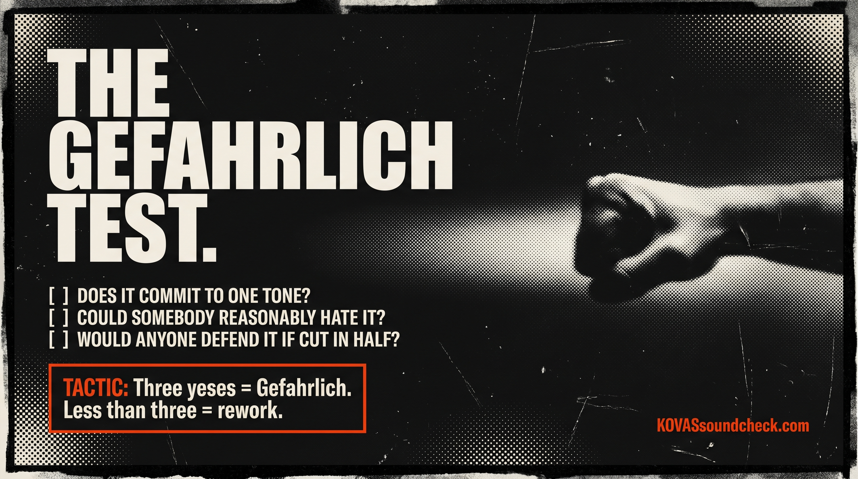
🔧 ONE TOOL: THE GEFÄHRLICH TEST
Tool/workflow: Before you ship anything, ask: does this grab the listener by the throat, or is it politely asking for their attention?
The hit: From the sync licensing highlights: You Got To Sound Gefährlich (German for “dangerous”). It means you want to grab ‘em by the throat with your music and create a compelling universe that pulls them in and is very hard to leave.
Gefährlich isn’t loud. It’s committed. The opposite of hedged. A polished demo that backs off in the chorus is not a song. It’s an apology with a snare on it. A minimal cue that commits to one mood and refuses to flinch is Gefährlich. Volume doesn’t matter. Commitment does.
Why it matters: Most work doesn’t fail because it’s weak. It fails because it’s unsure. The Gefährlich test is the check on whether your piece has a position or is just occupying airtime. If the answer is “I hedged in case somebody didn’t like it,” the hedge is the problem. The hedge is always the problem.
Business translation: Brands are built by the ones who commit to a taste position other people can refuse. If nobody could refuse your brand, nobody’s choosing it either. They’re just tolerating it. Gefährlich = somebody on the other side of the aisle, by design.
Liquid Death didn’t poll customers on the skull. They shipped the skull.
💰 Tactic to pocket: Three-question pass on your next deliverable. Does it commit to one tone? Could somebody reasonably hate it? If it got cut in half, would anyone in the room defend it? Three yeses = Gefährlich. Less than three = rework.
🃏 THE WILDCARD: APPLE + CHIP & DAN HEATH (BREAK A PATTERN)
Wildcard: The other tradition that treats contrast as doctrine. Advertising copy.
The hit: Apple’s copywriting rules, from a breakdown I’ve been sitting with:
- Rule 11: Contrast to complement.
- Rule 15: Break patterns to break boredom.
Cited inside that same rule, Chip and Dan Heath (Made to Stick): “The most basic way to get someone’s attention is this: Break a pattern.”
That’s the whole advertising business translated into one sentence. Apple built a trillion-dollar brand on ads that broke the pattern of every ad in the category. Silhouettes dancing on solid backgrounds when every phone company was shooting boardrooms. Black product on white background when every category shot lifestyle. Pattern break as doctrine, not decoration.
Why it matters: Directors, supervisors, founders. Your audience doesn’t have a taste budget. They have an attention budget. Attention budget is spent on pattern breaks. If you are in the pattern, you are not being spent on. You are being scrolled past. Your 200 impressions are very proud of you.
Every ad in your category looks like every other ad in your category. That’s not a category. That’s a support group.
💰 Tactic to pocket: Survey your category’s current pattern for 10 minutes. What do all the top 20 pieces of work share? That shared thing is the pattern. Break one element of it in your next piece. One, not all. Pattern break, not chaos.
📊 ONE NUMBER THAT MADE ME LOOK UP
Headline: First impression is the whole impression.
Nearly 1 in 4. Nearly a quarter of all streaming plays are abandoned in the first five seconds. (Source: sync-licensing highlights archive, which also reports the average instrumental intro is now five seconds, and 70% of songs charting 10+ weeks on Billboard start with a hard-hitting hook.)
Your sixteen-bar intro is a luxury your audience doesn’t care that you paid for.
Why it matters: If contrast doesn’t live in the first five seconds, there is no second five seconds. Audiences don’t “give it a chance.” They give it a verdict. Usually while the preroll is still loading.
Business translation: Same math applies to cold emails, landing pages, pitch decks, pilot openers, brand launches. The first five seconds is the whole decision. Put your sharpest contrast there. Not your explanation. Not your context. Not your logo fade-in. Your Gefährlich.
⚙️ THE MECHANISM
Contrast → Pattern Break → Commitment = Gefährlich
Contrast makes your plate memorable. Pattern break makes it visible. Commitment makes it unskippable.
Three moves. No hedge.
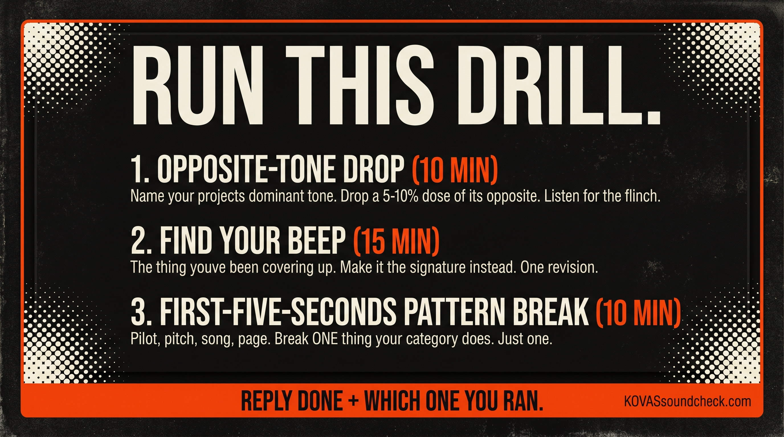
🎯 RUN THIS DRILL
- Open your current project. Name its dominant tone in one word. Drop in a 5-10% dose of the opposite. Listen for the flinch. (10 min)
- Find your censor beep. The thing you’ve been covering up. Make it the signature instead. One revision. (15 min)
- Take the first five seconds of your next deliverable: pilot, pitch deck, song, landing page. Break one pattern the category uses. Just one. (10 min)
Reply DONE + which one you ran.
🎬 SOUND + VISION
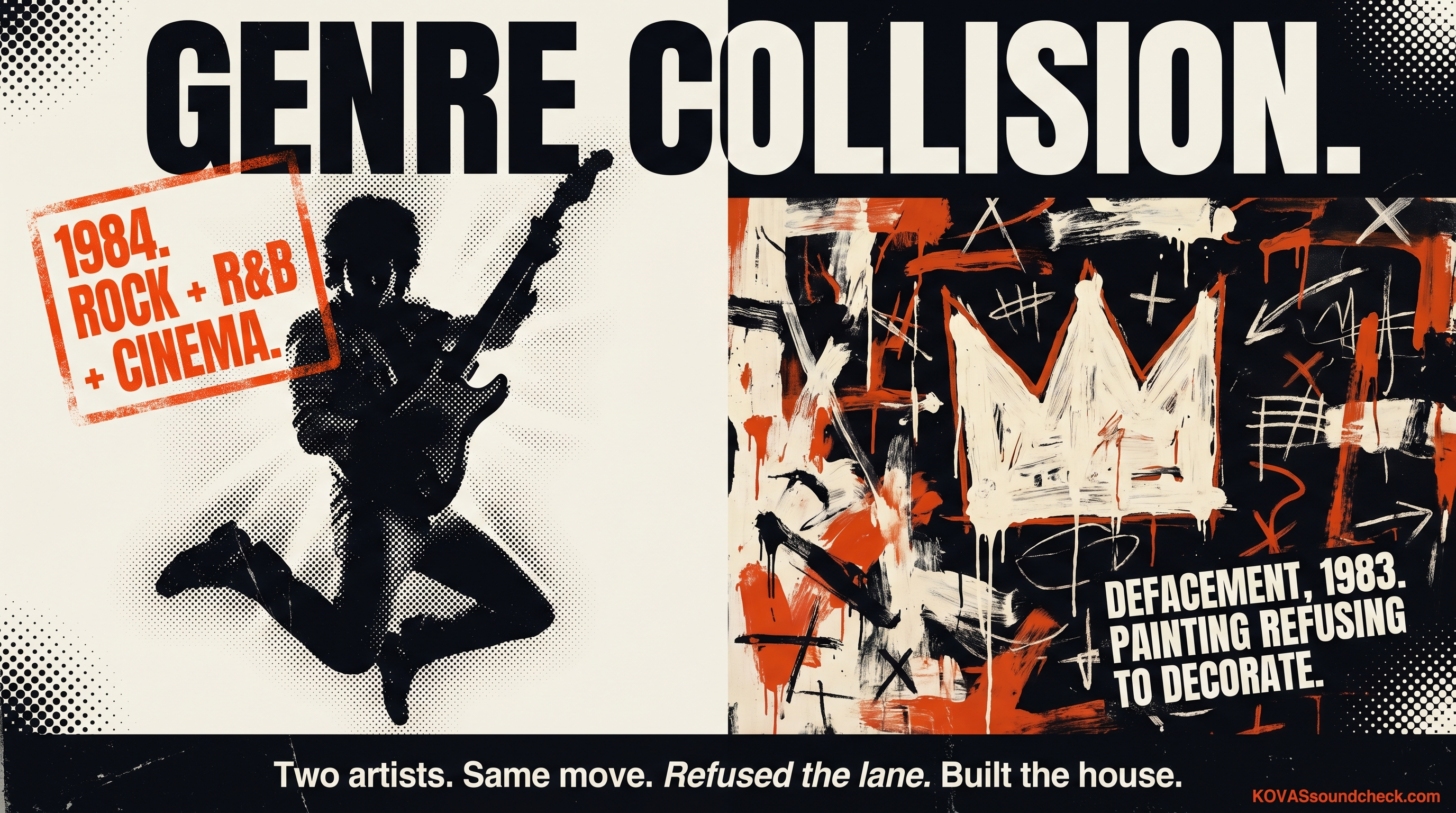
The moment: Prince, “Purple Rain.” Rock, R&B, and cinematic emotion on one plate, in 1984.
The industry had lanes. Rock was rock. R&B was R&B. You picked one. Prince walked into the middle of that decision and set it on fire. Not a fusion. A collision. A guitar solo over a gospel chord progression over a drum groove that didn’t belong to any genre. Nobody in the room signed off on that combination. He just did it. And a generation later we’re still living in the house Prince built instead of the one the industry prescribed.
Visual pair: Basquiat’s Defacement (The Death of Michael Stewart). Raw, unpolished, dangerous. A painting that refuses to be decorative the way Purple Rain refuses to be a genre.
That’s what Gefährlich sounds like. Not louder. Not bolder. Opposite. A genre collision so dangerous it created its own category.
💰 Tactic to pocket: Name the genre you’re “supposed” to be in. Name the one you’re not supposed to touch. Put a pinch of the second one in your next piece. That’s the Prince move. That’s the edge of the table.
🚫 NOISE CANCELLATION
Not it: polished on polished on polished. Not it: single-tone anything. Not it: hedging on your chorus because the bridge was safe. Not it: trying to be liked by the room you’re not in yet. Not it: “cinematic” as a personality trait.
If every piece of your work could be described with the same word, the word is “forgettable.”
💭 STUDIO THOUGHT
You can’t be memorable and comfortable in the same sentence.
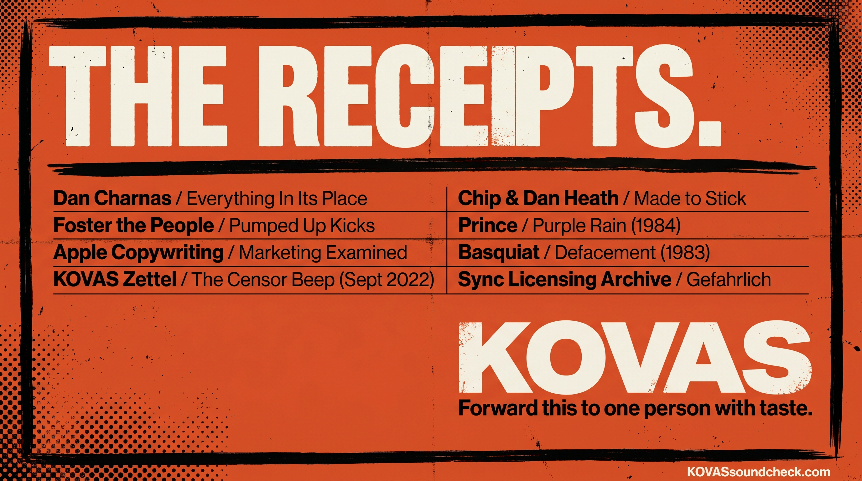
📚 THE RECEIPTS
- Everything In Its Place by Dan Charnas (mise en place + chef’s contrast as discipline; same author as Dilla Time)
- KOVAS Zettel: The Importance Of Contrast
- KOVAS Zettel: The Censor Beep Is The Hardest Transition (journal entry, Sept 2022)
- Sync licensing Readwise archive: Gefährlich / Reverse Word Painting / “edge of the table” / first-5-seconds data
- Apple copywriting rules breakdown (Marketing Examined)
- Chip & Dan Heath, Made to Stick, “Break a pattern”
- Foster the People, “Pumped Up Kicks”
- Prince, “Purple Rain” (Top 100 Culture-Shifting Songs #13: merged rock, R&B, and cinematic emotion; genre collision as identity)
- Basquiat, Defacement (The Death of Michael Stewart)
- The KOVAS Sound Check Playlist: https://open.spotify.com/playlist/4iXyeNatxWXUoADTJW06ez?si=cf80a36cf982425c
If this hit, forward it to one person with taste. You know the one.
Make it matter.
KOVAS
Subscribers received this in their inbox via Substack.